I never thought I would get emotional about toothpaste until I stood in my bathroom holding a half-used tube and started thinking about all the packaging we throw away. That was before I even looked at the sink.
Toothpaste has been a source of household frustration for as long as I can remember. There is the dried paste around the lid, the cap that never goes back on properly, and the mess that spreads no matter how careful you are. Far too much seems to go straight down the drain. At some point, this becomes a design problem as much as a behaviour problem.
I remember the old aluminium tubes. Bend one too many times and toothpaste would come out through a split in the middle. I think my parents must have resented that. Perhaps the mess my own children make is generational revenge. Changing the material clearly does not, by itself, solve the whole experience.
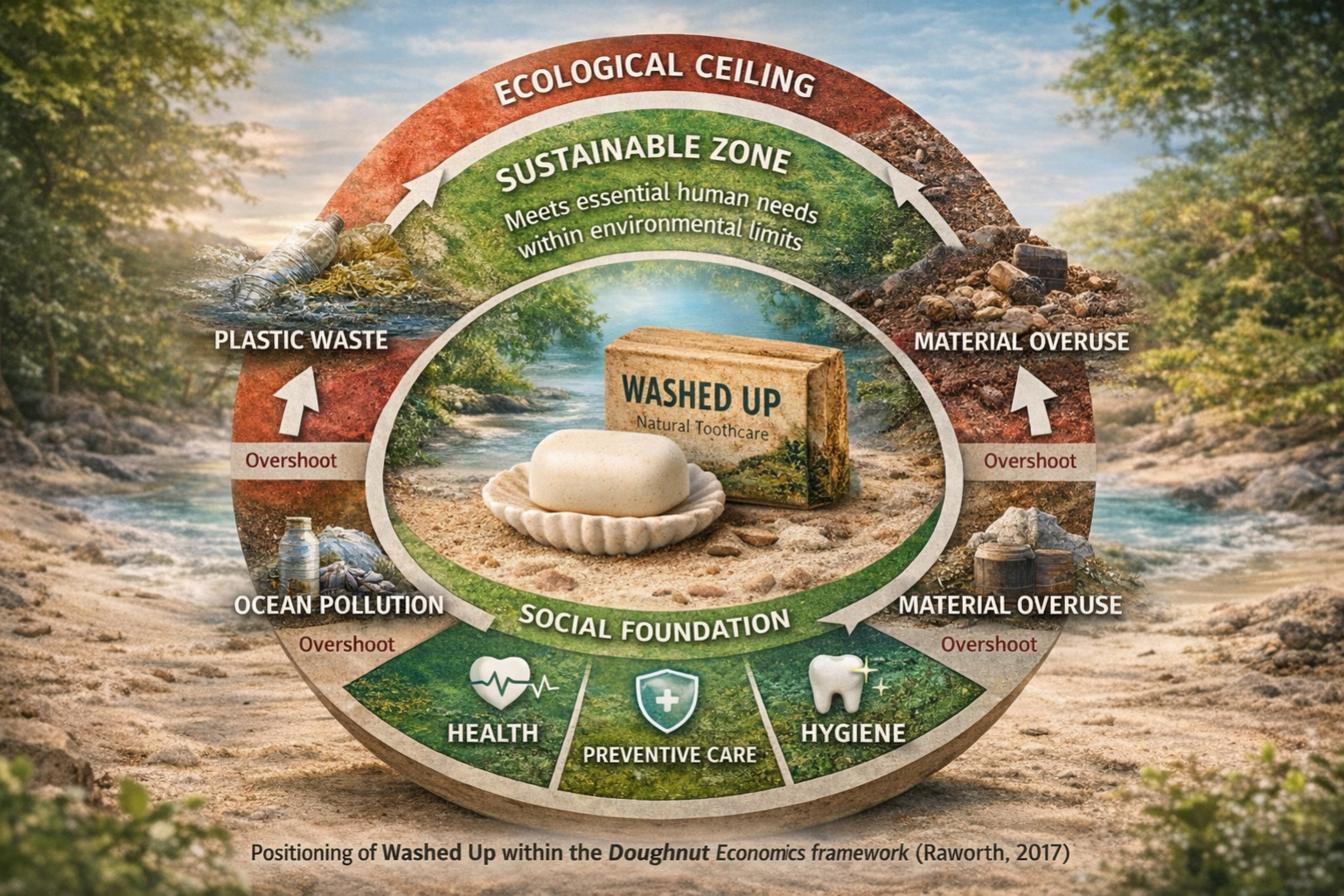
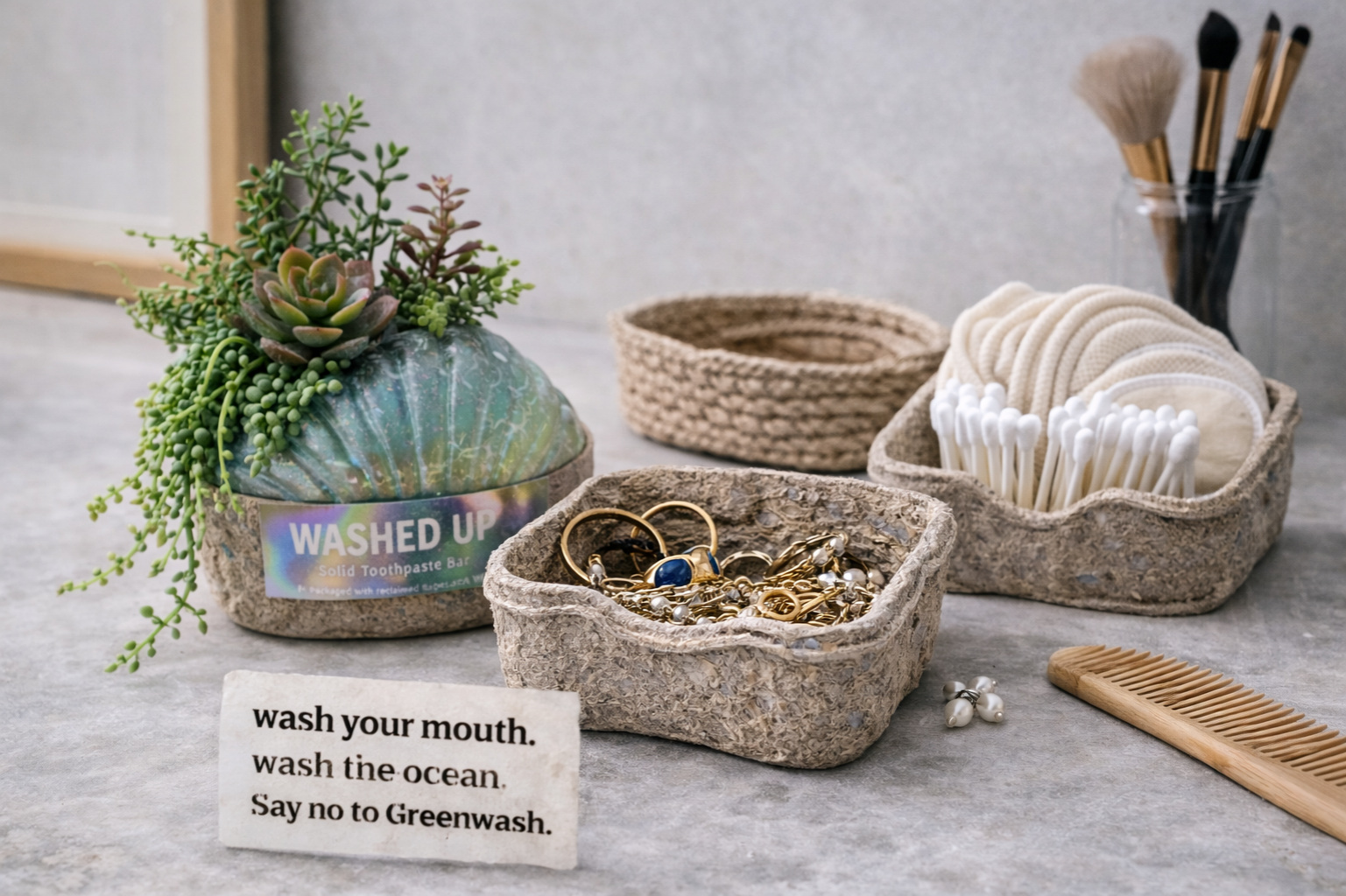
My concept is called Washed Up. It begins by questioning the tube altogether: a solid toothpaste bar in a reusable case, with a shell-inspired shape, soft curves and a frosted finish reminiscent of sea glass. The intention is to make the object something you want to keep, while exploring a format that could reduce squeezing, mess and discarded packaging.
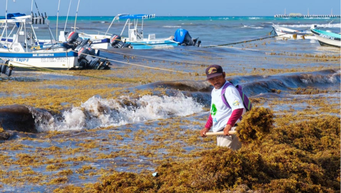
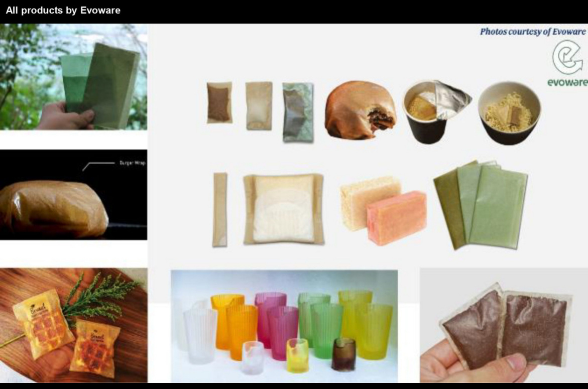
For the outer packaging, I proposed investigating processed Sargassum fibre. The design idea takes its cue from algae washing onto the coast of Cancún: could a local material problem become part of a useful packaging system? I imagined a textured fibre cradle, visibly different from a conventional plastic pack, around the more refined reusable case.
The name does several jobs. Washed Up refers to what arrives on the beach, to cleaning, and to the possibility that an everyday system has had its day. “Wash your mouth. Wash the sea.” The ambition is emotional as well as practical: something unwanted becoming something desirable.
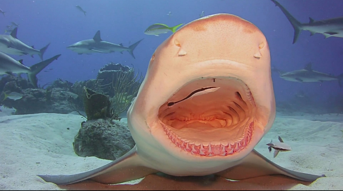
The shape deserves testing as well as the material. A shell-like form made me think about durability, water shedding and achieving strength through geometry. Does that inspiration make the product easier to handle, store and keep clean in an ordinary bathroom? Nature offers the design question; a prototype has to earn the answer.
The format also changes the action it invites. A tube encourages squeezing, while a solid bar invites rubbing. That may change dispensing behaviour, but it would need to be tested with real use rather than assumed from the shape. The sustainable option should be understandable and practical without requiring heroic self-control.
The environmental story has to connect the entire system. Sourcing, processing, transport, use and end-of-life all matter. A natural material or a seaweed origin story cannot establish the outcome on its own. Sustainability should be central to the product and the habit it encourages, with evidence behind the claims.
The concept still has to earn those promises. A shared solid format raises questions about hygiene, dosage and comfort of use. Sargassum packaging would need testing for suitability, processing impacts and what actually happens to it after use. Calling a material natural is not enough to establish that the finished package is safe, compostable or environmentally preferable.
I have experimentally tried plenty of alternatives, including charcoal powder, and nothing has quite compared with the familiar experience for me. That matters. A redesign has to work for people in the bathroom, not just look convincing on a mood board.
Less mess. Less waste. Fewer arguments at the sink. Those are the goals. Even the smallest objects deserve better thinking, and the most useful sustainable design may begin with something as ordinary as a toothpaste cap that nobody puts back on.



References.
- Benyus, J. M. (1997). Biomimicry: Innovation Inspired by Nature.
- Lilley, D. (2009). Design for sustainable behaviour.
- Gershoff, A. D., & Frels, J. K. (2015). What makes it green? The role of centrality of green attributes in evaluations of the greenness of products.